
Willem Toet explains…CFD Post Processing. Part 2
Welcome to the second part of a three-part series by former Head of Aerodynamics at Benetton, Ferrari and Sauber F1, Professor Willem Toet, who exclusively explains CFD Post Processing in depth.
X-Ray plots
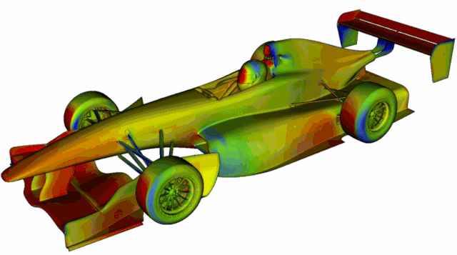
So called X-Ray plots do pretty much what they say and can be created in any direction so you can look at, for example, drag, downforce or side force.
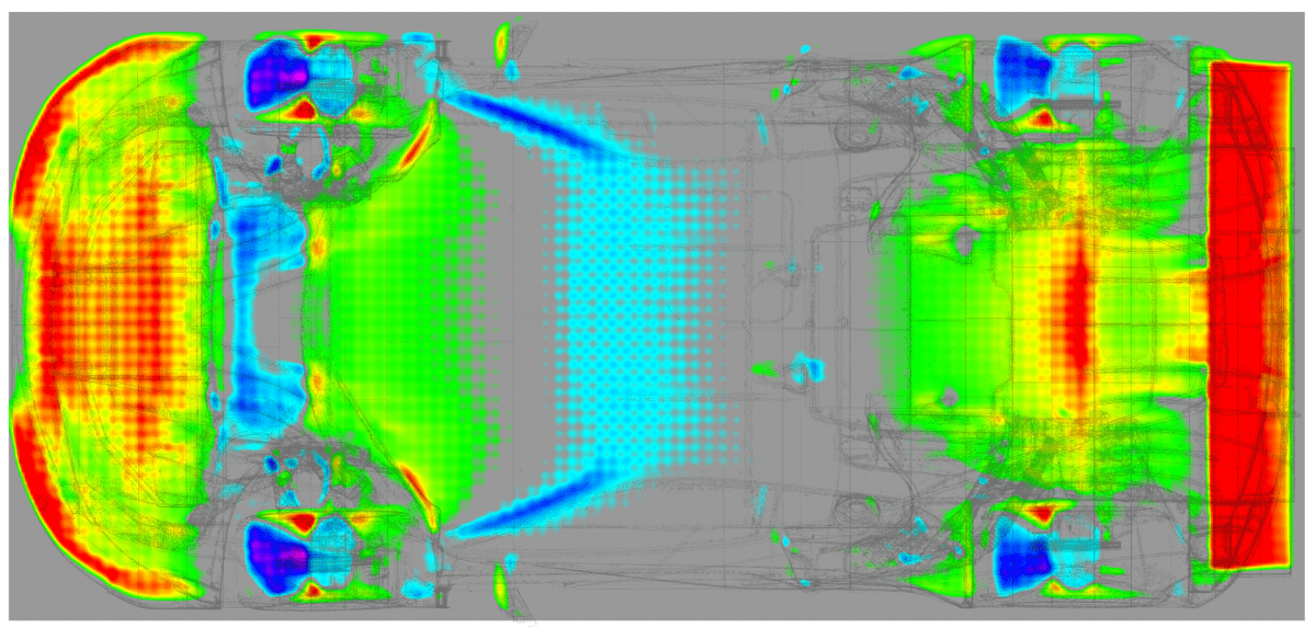
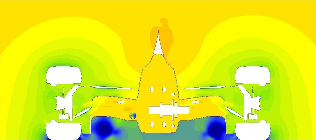
27a and 27b. X-Ray plot of downforce on a generic GT car. The plot is created by adding up all the pressures acting on all surfaces of the vehicle and is created in a zoned way. The size of the zones for this calculation can clearly be seen in the image. These can be particularly useful when you’re first learning. I haven’t used them for F1 but I have wanted them when working on other projects to allow communication about the distribution of drag and downforce (in particular). They can be particularly useful when comparing quite different geometries (e.g. looking at lift and downforce distribution differences). Also they are useful for looking for sudden changes of lift to downforce and for areas of high lift / downforce far from axle centrelines (like the front downforce generation here – car may be peaky). Thanks to TotalSim.
Cutting Through the Body and the Air
Aerodynamicists will sometimes look at a view of a whole car when assessing the aerodynamics. They will, more likely, want to look in much more detail. Often, they will want to look at images that show them what the airflow is doing inside bodywork, brake ducts, and in the air around downforce generating elements. One way of doing this is to create slices of airflow information in planes around/through the car.
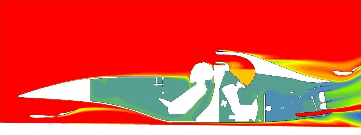
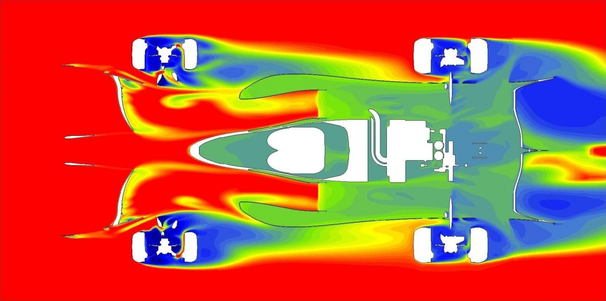
28. This is a cross section through the car somewhere close to rear axle centre line, and shows Cp (coefficient of pressure = “static” pressure). See how the static pressure under the car is lower than it is above.
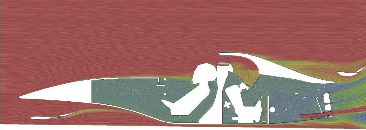
29. This longitudinal cross section shows CpT (total pressure = energy in the flow relative to the car). With this type of plot, you can get an initial idea about how effectively aerodynamically important items have been places. If you put something into a blue (very little energy) area, you cannot expect it to do much. So a plot like this can tell you where you still have high energy air to play with.
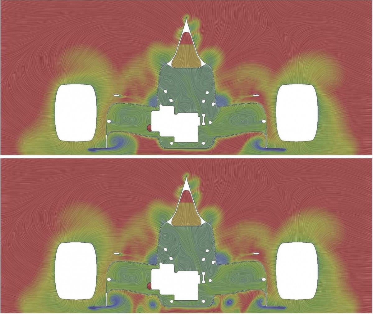
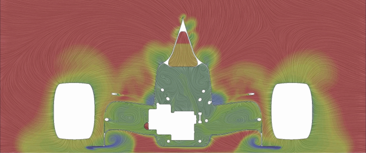
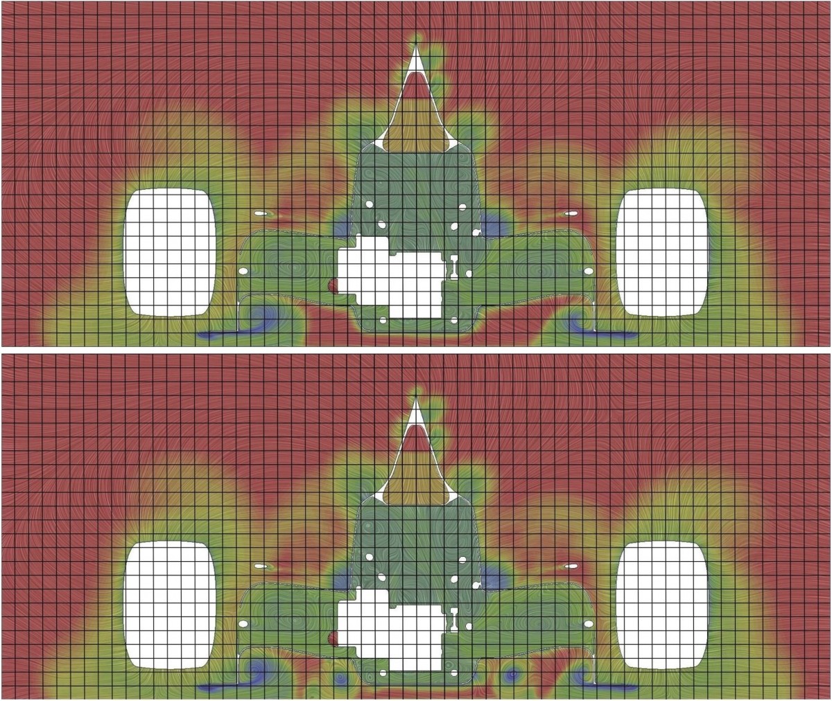
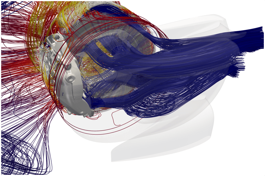
31. This cross section just in front of the side pods of an open-wheeled race car shows some aflow structures created by the wheels and by the front wing / end plates as well as a barge board. Image, as many here, courtesy of TotalSim – CpT with LIC.
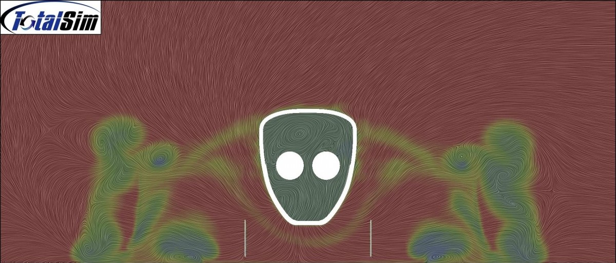
32. Horizontal cross sections (of CpT in this case) like this give some particularly useful information. This slice cuts through the (open-wheeled) car at about mid-wheel height. These plots take some time to understand. The suspension is sending low-energy air into the side pods so could be improved, and tyre wakes are pulled in towards car centre line (very different to F1 today).
These images can be stored separately or stitched together into movies.
33. Example of movie that can be used to string these images together. It shows CpX (Coefficient of pressure in the fore/aft direction). The car is the 2017 Perrinn F1 model (thanks) and the movie is shown courtesy of Creo Dynamics (thanks to Torbjörn Larsson)
Comparing cases
There are many ways to compare different cases or different running attitudes (height, yaw, steer etc.).

36. Animated GIF image of the two images shown above. Here you can really visualise the magnitude
of the change of wing position as well as some of the pressure changes.
One way is to use a delta of a parameter that will help you to understand what has changed. These
take a little while to get used to because the scale means something very different to an absolute plot.
In the case below, the front wing height and angle have been changed. The plot is coloured black
where the geometry is not the same.
42. Here is an example of two cases that have large parts added (lower plot) to create an additional
vortex in each sidepod. The main changes in the flow features are visible and clear, but the impact
they have elsewhere is not so obvious.
44. An animated gif makes it easier to spot subtle changes in already existing flow features but it is still hard to measure how far features have moved. The motion itself makes that hard. No problem…
46. Just add some reference lines that are in the same places in each case. Now you can measure flow feature positions with a much smaller zone. When you want to study flow in detail, you need a fine (high quality) mesh and high-resolution images. Even in F1 I’ve had people try to analyse the presence of a 0.5mm step when the mesh size is of about the same size; the maths and method used is against you! My friend Torbjörn Larsson at Creo Dynamics pointed out, quite correctly – “One thing I often stress is the importance of mesh consistency while making design changes. If you replace one particular part, try to keep the rest of the mesh the same as far as possible. More than once, I’ve seen people making design improvements “polluted” by unwanted mesh effects…” Just love having useful feedback to improve things – obvious to those who have been in the business a while but worth stating for sure.
Analysis of Sub Components
You will see in the report further down that the overall test vehicle is broken down into sub components. It follows that pictorial analysis could also be used for these sub components. In F1, with big resources, we look at many areas in detail, also pictorially. An obvious area may be radiators or brakes for cooling (velocity, pressure drop, shear stress) etc.
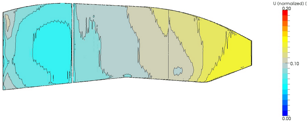
48. Normalised velocity through a radiator core. This is a large core with a velocity range of 5% to about 15% of vehicle velocity.
Frame of Reference for Post-Processing
This won’t be an issue if you have a single attitude for your testing – which is OK for learning how things work but cannot be the long-term goal.
For looking at forces on a racing car, using a frame of reference at ground level makes complete sense because that is where forces are resolved. For other types of analysis it depends… For pictures, if the frame of reference is the ground, then the ground and (mainly) wheels stay “still” while the car moves around (ride height changes etc.). This makes looking at changes on the bodywork and, in particular changes on internal surfaces (cooler ducts or coolers for example) harder.

50. Example of how an attitude change will look if you use the ground as the reference frame for post-processing of images.
If the frame of reference is the car, different car attitudes will result in the ground plane, suspension, steering, wheels and tyres moving around relative to the car body. If the change in car attitude is large it doesn’t matter – the body stays in the same place in your images, and changes in aerodynamic parameters on the body can be directly compared.
52. Here, the frame of reference is some coordinate system based on the car. Given most aero work is to change the bodywork then making the car the frame of reference is usually best for aero development.
For wheel-related items, e.g. brake ducts, a special frame of reference is worth creating so that these can be compared with ease (e.g. different ride heights, roll angles. steered vs. straight ahead, vs.yawed).
So, the message is – think ahead about what you will need from your post-processing and create tools to suit the needs of the project both shorter and longer term.